How the Market Repeats Itself
A beautifully structured Euro JPY move showing how buffer zones, whale entry, and market maker exits repeat again and again. A clean example of accumulation, manipulation, and distribution in real time.


When I came into the office this morning and opened up Euro JPY, it was one of those charts that immediately makes you stop and look twice.
Everything was there.
A clearly defined upward-moving market. A clean, disciplined uptrend. Price pulling back, not in panic, but with structure — doing exactly what you would expect when larger participants are involved.
As price dipped back down, it moved neatly into the buffer zone. This is where things become interesting, because this is where the whales step in. You can see the pressure point form clearly. Once that happens, the rest is history.
Price accelerates upward, runs cleanly to the top of the range, and then we see the market makers exit. Profits are taken. The long positions are closed. And then, just as predictably, the market is re-sold back down again.
Nothing random. Nothing emotional. Just structure.
As price comes back down, it once again dips into the buffer zone, lifts briefly, and then continues lower. Eventually, we see fracturing appear — not at some arbitrary level, but within the historic buffer zone itself. From there, the market transitions into a sideways phase.
This is poetry in motion.
The same behaviour, repeating again and again. Accumulation, manipulation, distribution — not as theory, but as something you can actually see unfolding in real time.
These are exactly the types of videos many of you are now sending me. I simply review them, annotate what’s happening, and report back. It makes the process incredibly clean and very efficient.
Enjoy the charts, enjoy the structure — and have a great Christmas. I’ll catch up with you very soon.
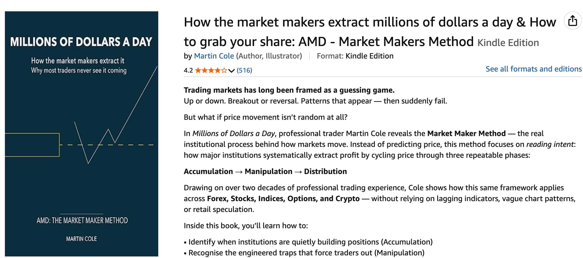
New Book Cover
(I thought my image was a bit misleading, with that good head of hair I had)